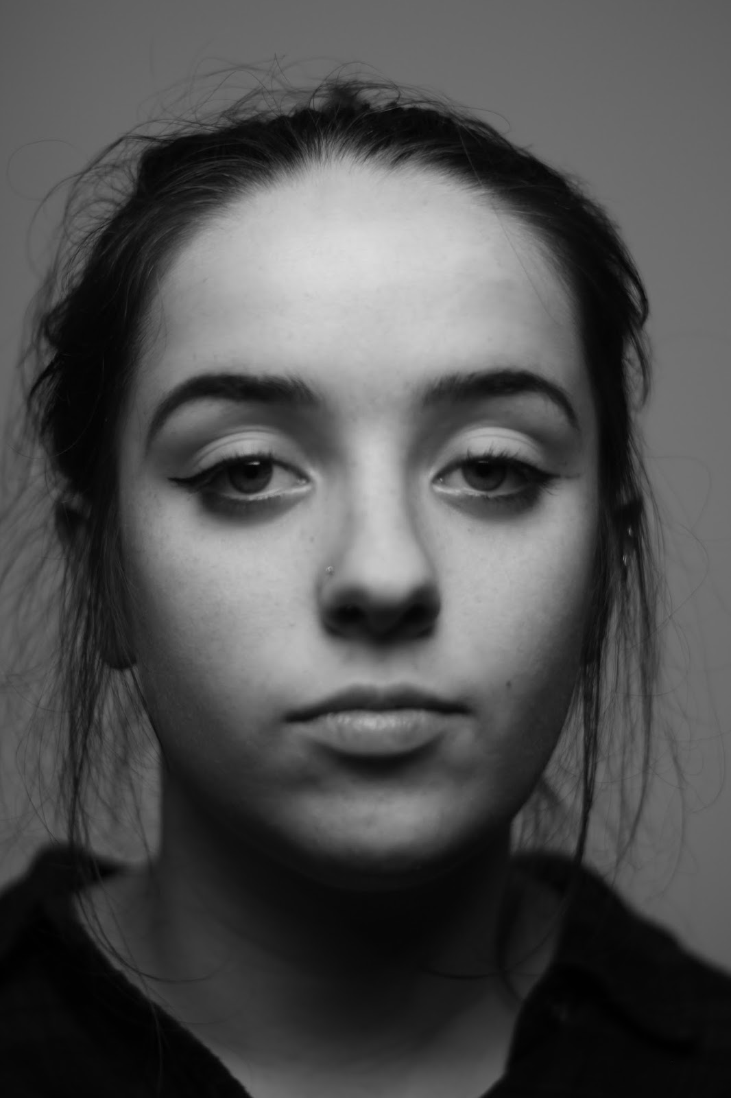
Wednesday 30 March 2016

Rule Of Thirds Field Mission

Create 10 Photographs using the rule of thirds. You must properly compose, expose and capture pictures of the following:

Subject Specifications:
  1. A person facing the camera, closeup on head
  2. A person facing the camera, closeup on head, looking to the upper right or upper left
  3. A person facing the camera, closeup on head but turned 45 degrees from camera and not looking at camera
  4. Two people facing the camera, closeup on heads looking into camera
  5. Two people facing the camera, closeup on heads but subjects are looking to the upper right or left
  6. Two people, one in the foreground, one in the background out of focus (depth of field)
  7. Two people, one in the foreground out of focus, one in the background in focus (depth of field)
  8. An object or objects
  9. A landscape view
  10. A tree

1. 

2. 

3. 

4. 

5. 

6. 

7. 


8. 


9. 

10. 


Contact Sheet


Monday 21 March 2016

Photography and Composition: The Rule Of Thirds

The Rule of Thirds is a way of composing photographs in which points of interest in the photograph are positioned in a way that brings focus to them and is aesthetically pleasing.You divide your photo into a grid of nine squares (two horizontal lines splitting the rectangle into thirds and two vertical lines doing the same). The Rule of Thirds states that points of interest in your photo should be positioned on the points of intersection of these lines (four points), or on the lines themselves.


Despite the many people, this photo's focal point is clearly the guy leaning against the wall. The Rule of Thirds accomplishes this because the guy's body aligns with the left vertical line and his head lies directly on the left upper point of intersection. Perhaps less obvious is that the right vertical line neatly cuts across the photo precisely at the left edge of the blonde girl. The people's dark suits contrast with the light grey concrete, bringing dramatic emphasis to the photo. 


In this photo, the guy on the left is on the vertical line in the Rule of Thirds Grid. He is in focus whereas the people at the traffic  lights across the street are out of focus, and this picture creates a real sense of space with the small size of the people crossing the rode compared to the focal person of the shot. There is a sense of unity in the photo as the two guys are both looking at their papers.


There is a sense of symmetry here due to the two people facing each other and both lying on the two vertical lines of the Rule of Thirds grid. This adds emphasis to what appears to be a serious conversation. Furthermore the girl's face is on the upper left point of intersection, drawing attention to her interested, slightly ambiguous, facial expression. 


The focal point of this photo is the guy to the right, due to the small aperture, and the fact the crisp edge of his face lies on the right vertical "Rule of Thirds" line. His focus and attention (he is in focus) contrasts with the distraction of the girl to the right (who is more out of focus). The edge if the black chair (color contrast with the background of the photo) lies on the bottom horizontal "Rule of Thirds" line. The man in the background, to the right, also lies on a vertical line, so one could debate whether he is the person the main guy is looking at. 


This photo makes good use of the Rule of Thirds. The center of the  girl's face lies exactly on the upper left intersection. Also, the round, gold sign, which says "Superior Court of California, County of Sacramento", lies on the right vertical line with the wall line matching up with this line exactly. The image also makes use of the movement with the guy on the left clearly walking, depicted by the motion blur - creating a sense of urgency which is reinforced by the fact that the two people to the right are staring at him as he moves. 


This photo is similar to the third one in that it has two focal points - the two people - lying on the two vertical lines of the "Rule of Thirds" grid. This equal spacing creates creates a sense of symmetry and harmony between the subjects. 


[Photos from Mock Trial State Finals in Sacramento]

Wednesday 16 March 2016

Static and Dynamic Composition with Emphasis

Static Composition

Portrait

This image is static, with the three subjects vertically parallel to one another, and with their three faces on the same horizontal plane. Their emphasis is achieved with the relatively small depth of field (the background is slightly out of focus) and the middle person's dark hair and attire stand out against the light colors of the background. In addition, the subjects' cups of boba tea are all approximately vertically parallel and on the same horizontal plane giving a sense of unity in the photo. The background complements this as it is also static, with the perpendicular vertical lines of walls and counters apparent.


Still Life

This still life, set in my cousin's garage, is clearly static with all the tools creating vertical lines, parallel to each other, and photographed straight on. I would say the dominant point of interest in this photo is the radio on the box of drawers, which is large and imposing. The subordinate elements, like the boxes in the left background, complement the vertical lines of the radio as they too have vertical edges perpendicular to them. The tonal gradations in the yellow and brown are aesthetically pleasing, along with the repetition of the spanners. There is a cramped sense of space in this photo due to how full it is with different items, however unity is created due to many of them having a "mechanical" use.

Architecture


The symmetrical architecture of Santa Cruz High School is the dominant point of interest. This is clearly a static image with the vertical pillars parallel to one another and the upper edges of the building parallel with the bottom edges of the building and the steps. It is basically a bunch of perpendicular lines. The subordinate elements, like the trees and the lampposts, complement the dominant elements of the school building like the pillars and windows. Emphasis is brought to these features in particular because of the darker color of the window frames and darker value between the pillars. This Neoclassical building looks especially imposing, with it towering above the viewer, due to upward angle of the camera.
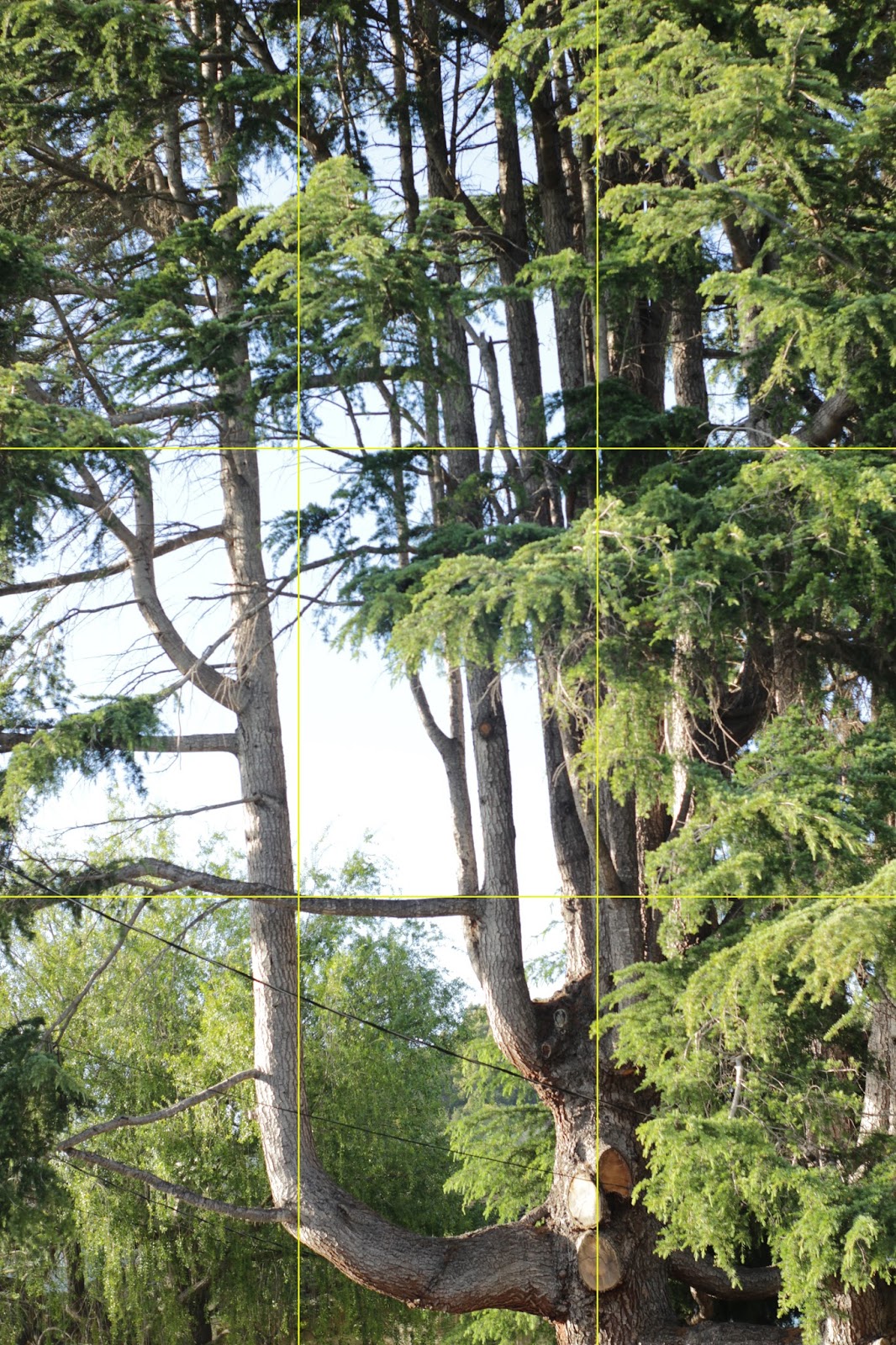
Landscape


This image is static because the crisp horizon of the grass is totally level, approximately parallel to the tops of the trees, and parallel to the darker line of grass that my dog stands on. My dog, is also parallel to to the horizontal line in the image. I would say my dog, and the trees, are the dominant elements in this picture. Their darker colors are complimented by the the darker line of grass, about midway through the image. In fact, the dark green of the shadow seems to match the tree hue perfectly. This landscape image utilizes the rule of thirds, with the upper third of the image containing the trees and sky, It creates a sense of space as the small dog, seems very far away from the short trees (proportion). 

Dynamic Composition


Portrait


This is an ultra dynamic photo, with many conflicting angles. The dominant point of interest in the photo is the people. Their emphasis is created through the contrast of their dark clothing and hair against the white background. We have the angle of the back of the boy's shirt, the man's left shoulder, and the curved left side of the man's shirt. The subjects' bodies and heads are literally at an angle. This complemented by the subordinate elements of the headboard of the bed and the picture frame. They too are at angle due to the tilt of the camera, and overall these angles create a sense that everything is falling over (movement), and this is fitting with the playful theme of the image. 

Portrait 2


Still Life


This image achieves dynamism because the dominant point of interest and its subordinate elements are at angles that aren't perpendicular to the photo frame or to each other. The dominant element is the edge of the marbles box lid. This is because of its central placement, and focus in contrast to the other blurred elements. This was achieved through using a small aperture. The subordinate elements, like the boxes, plastic toys and foot, support the dominant element as they too are at an angle. There is harmony in the color blue of the marble box, the foot and blue plastic, and the overall blue-ish tone, created by the white balance, and gives a sense of a rainy day indoors. There is unity in the theme of playtime or toys.

Architecture

I like that the Brutalist architecture of the Santa Cruz Courthouse is contrasted somewhat with the nature in this photo (ying-yang). The dominant elements in this photo are the plants in the foreground and the dark space beneath the building, emphasizing the building above. This photo is dynamic as the dark space is at an angle, as are the edges of the architecture. The dark space almost seems to divide the architecture from the nature. The leaves on the plant to the right are also at an angle, almost pointing toward the building. This dynamism is supported by the edge of the hedge and the angle of the cherry blossom trees. This photo utilizes line and the repetition of the windows to show this contrast between nature and man-made. 

Architecture 2

Landscape


The angles of the dominant hedge, skyline and road-line show this image to be dynamic. The dominant point of interest is the hedge, which covers the steep drop of the street as it disappears from sight. The traditional landscape of the coastal town pokes through, showing how high up the the street is. The downward angle of the street (grey contrasted with green) gives a sense of steepness also. The shadow on the street emphasizes this downward gradient. The shape of the trees (subordinate elements) are rather striking (straight edged tops and clear blue sky backdrop) and they match the angle of the sloping street. 
 

Landscape 2


Thursday 10 March 2016

Principles of Exposure: ISO and Noise

Part A:  Produce 4 images showing the range if ISO settings from low to high


Part B: Exposure


Aperture: 


The aperture (opening) of a camera is refers to the series of blades that open and close over each other to control the diameter of the lens, and hence, the smaller the aperture the less light is let in the lens (and vice versa). 
As well as controlling how much light is in an image (exposure), the size of the aperture can be used to change the 'depth of field' in an image. The depth of field refers to how much of the image is 'in focus' or crisp. A shallow depth of field means that only a small portion of the image is in focus and the rest of the image (in front of and behind the subject of the image) is blurry. This is achieved by using a large aperture (light is refracted more farther from the centre of the lens). Conversely, a large depth of field refers to a greater area of the picture, around the subject, being in focus. It is achieved by using a small aperture (only near the centre of the lens, which is less curved, is being used, and so there is less refraction).


Large Aperture


Small Aperture


Shutter Speed:

The shutter speed of a camera refers to how fast the shutter opens and closes. The mirror behind the lens reflects the light through the viewfinder. When a photo is taken, the mirror is flipped out of the way to expose the film to the light of what the camera is pointed at. How fast the mirror is flipped out of the way and returns back to its resting position is what we know as "shutter speed". Obviously the longer it takes for the mirror to return to its resting place, the longer the film is exposed to the light and the brighter your image will be. Conversely, the faster the mirror is flipped back to its resting position, the less time the film is exposed (to the light) and the darker your image will be.
Shutter speed controls an extra dimension, when shooting things in motion: motion blur.
To eradicate the motion blur in an image, you must use a fast shutter speed. This is because the faster the image is taken, the more likely it is to capture the object mid motion (when it hasn't moved a great very much in the time the photo is taken). So your shutter speed should be proportional to the speed of what you are photographing (if you want to their to be no blur).
If you do want their to be motion blur, you can control how much blur, by making the shutter speed slower than your object in motion. How much slower you make it (the discrepancy between the speed of your object and your shutter speed) will dictate how much blur there is.

Slow shutter speed

Fast shutter speed

ISO

The ISO is the standardized industry scale for measuring sensitivity to light. Changing the ISO on your camera changes how sensitive your camera sensor is to light. A high ISO is useful for dark conditions, however it should be the last principle of exposure changed to increase exposure, because a high ISO sometimes produces a grainy effect on your photograph called "noise", and this tends to be considered undesirable.
Every time you change one element of the exposure triangle, the other elements are affected. 
In the example below, the ISO is being increased in each portion of the photograph. However, the overall exposure remains the same throughout the multiple images of the same thing. Each change in the ISO is equal to one F-stop (change the exposure by a factor of 2). Therefore if you increase the ISO by one F-stop then the aperture or shutter speed needs to be decreased by one F-stop so that the overall exposure remains balanced. 


Wednesday 9 March 2016

Principles of Exposure: Capturing and Controlling Value - Studio Lighting Patterns

Split Lighting
Loop Lighting

Rembrandt Lighting

Butterfly Lighting
Broad Lighting
Short Lighting


Experimental Lighting